ItemDelegate QML Type
Basic item delegate that can be used in various views and controls. More...
| Import Statement: | import QtQuick.Controls |
| Inherits: | |
| Inherited By: | CheckDelegate, RadioDelegate, SwipeDelegate, SwitchDelegate, TableViewDelegate, and TreeViewDelegate |
Properties
- highlighted : bool
Detailed Description

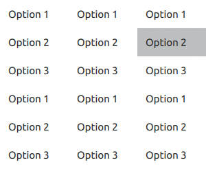
ItemDelegate presents a standard view item. It can be used as a delegate in various views and controls, such as ListView and ComboBox.
ItemDelegate inherits its API from AbstractButton. For instance, you can set text, display an icon, and react to clicks using the AbstractButton API.
 ListView {
     id: listView
     width: 160
     height: 240

     model: Qt.fontFamilies()

     delegate: ItemDelegate {
         text: modelData
         width: listView.width
         onClicked: console.log("clicked:", modelData)

         required property string modelData
     }

     ScrollIndicator.vertical: ScrollIndicator { }
 }
See also Customizing ItemDelegate and Delegate Controls.
Property Documentation
highlighted : bool |
This property holds whether the delegate is highlighted.
A delegate can be highlighted in order to draw the user's attention towards it. It has no effect on keyboard interaction. For example, you can highlight the current item in a ListView using the following code:
 ListView {
     id: listView
     model: 10
     delegate: ItemDelegate {
         text: index
         highlighted: ListView.isCurrentItem

         required property int index

         onClicked: listView.currentIndex = index
     }
 }
The default value is false.